Student Loan Website (Navient Redesign Challenge)
This project began as a design challenge to demonstrate my approach as a UX designer across various industries and subject matters. The first challenge was to redesign single existing Student Loan Account Summary page. Key design considerations include information hierarchy, visual hierarchy, and a modern UI to create a more effective, user-friendly interface for student loan website users.
The full Figma project file and case study deck could be found here.
ROLE
UI/UX Designer
TEAM
Solo
TOOL
Figma
DURATION
2-3 days
THE TASK
Redesign the UI/UX of the account summary page
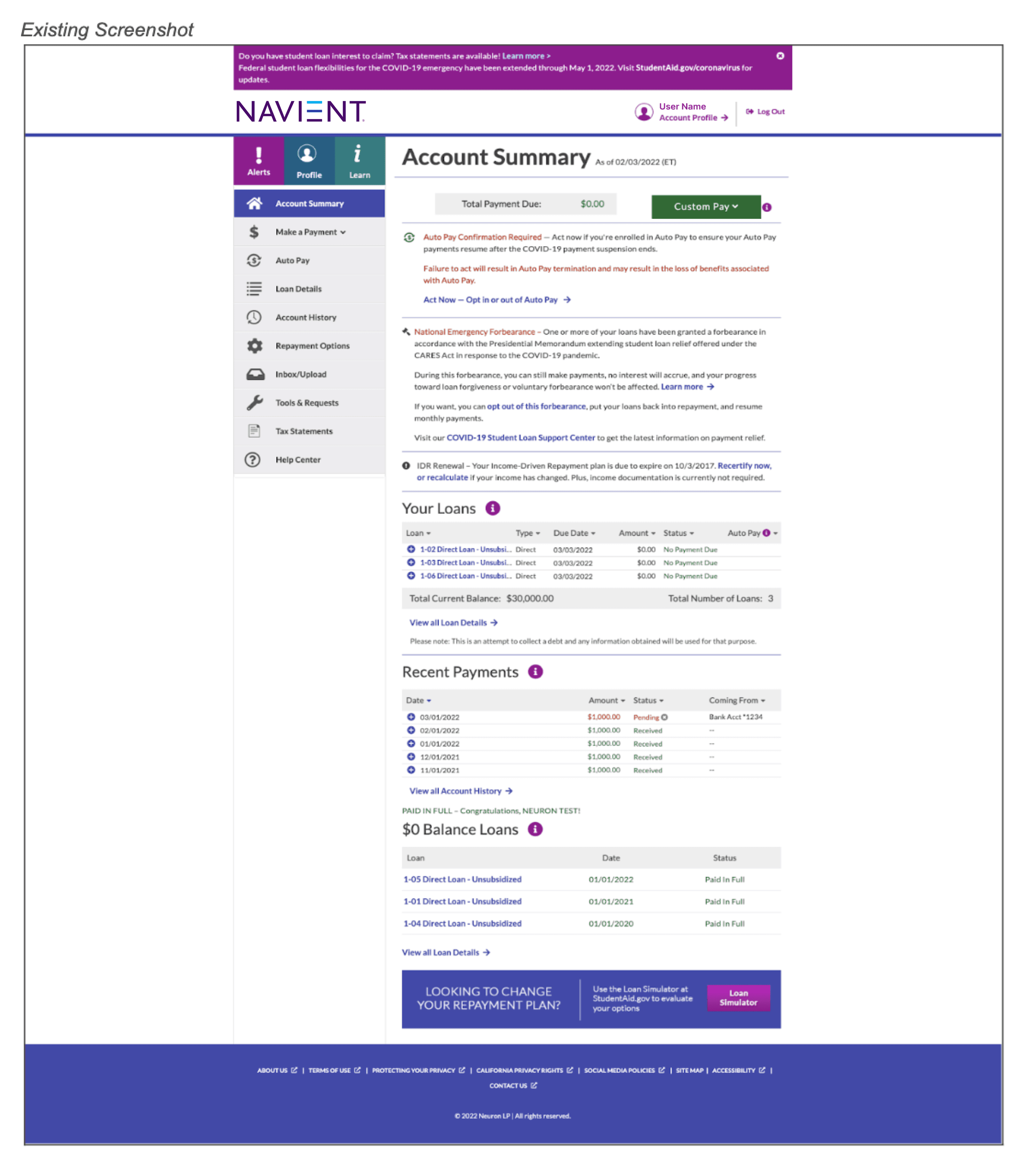
To begin with, I didn't have strong understanding of what a student loan page is, as I have never personally used it or have seen my friends use it before. Given the unfamiliarity of the subject, I first did a short preliminary research on student loan websites and their account summary pages. I guided this research using three key questions that helped me understand their purpose and underlying intentions.

What is a student loan website?
What overview does account summary page give?
What information is most crucial?
SOLUTION
More intuitive loan details through visual hierarchy and better UI
Simplify content and enhance visual and information hierarchy for more intuitive loan details
Streamline alert system for heightened user awareness
INITIAL APPROACH
Let's start by defining
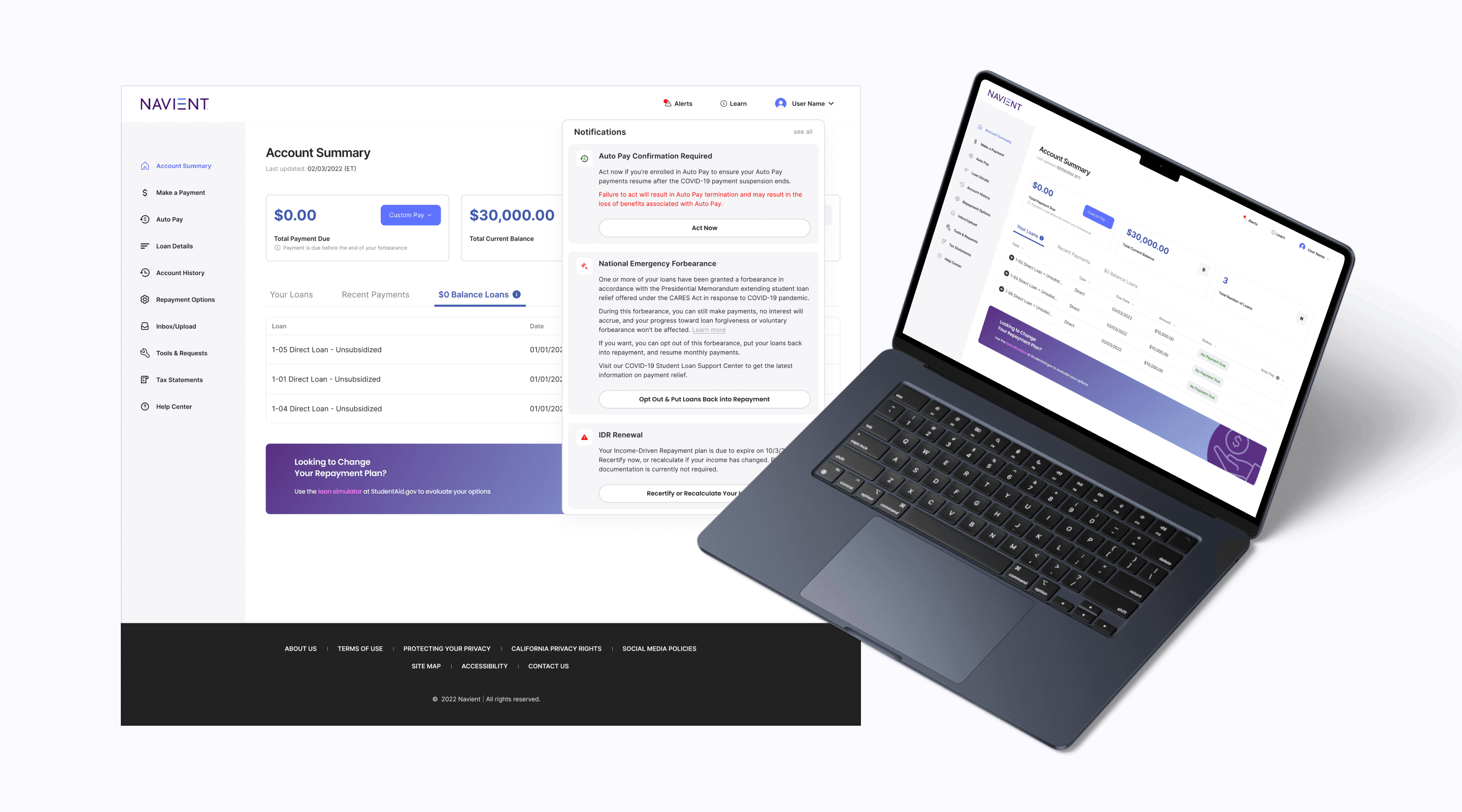
I first identified details that I already have knowledge of, or could find within the screenshot of the account summary page. Furthermore, designers are often required to make practical, research-backed assumptions when complete information isn’t available. With only a screenshot of one page provided in the design challenge, I made a few informed assumptions to guide my design decisions.
💡 What do I know already?
Screenshot of the account summary page was taken during Covid-19 pandemic, where student loan payments and interest were pause for federal loans
User has been granted forbearance
User no longer has IDR plan active
The total current balance is the unpaid balance of the loan
❓ Assumptions
$0.00 Total Payment Due is due to forbearance
Alerts on Account Summary page match those in the Alerts tab above navigation bar
Profile on tab matches those in header (redundant information)
Not all icons and colored texts are CTA buttons (blue are the only buttons)
USER AUDIT
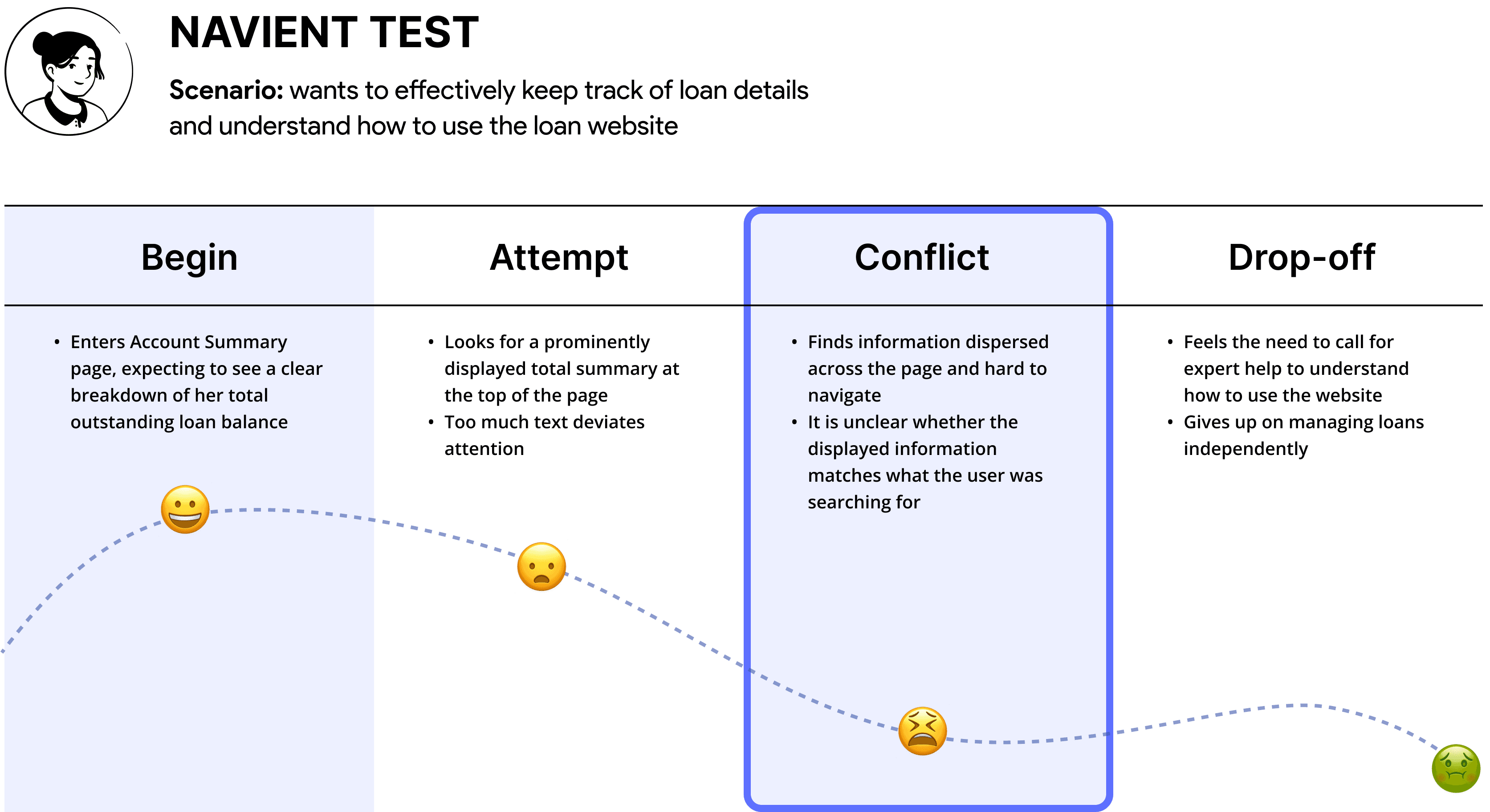
Self user audit
I first performed a self user audit on the page to discover major, minor, and cosmetic problems that could be enhanced during this design challenge.

USER RESEARCH
Peer user testing
I asked peers to identify confusion or frustrations to uncover pain points, set clear goals, and research user needs.
Each of these peers has recently finished college or is currently in school.

OVERALL INSIGHTS
Key Insights
01
Information Overload &
Poor Visual Hierarchy
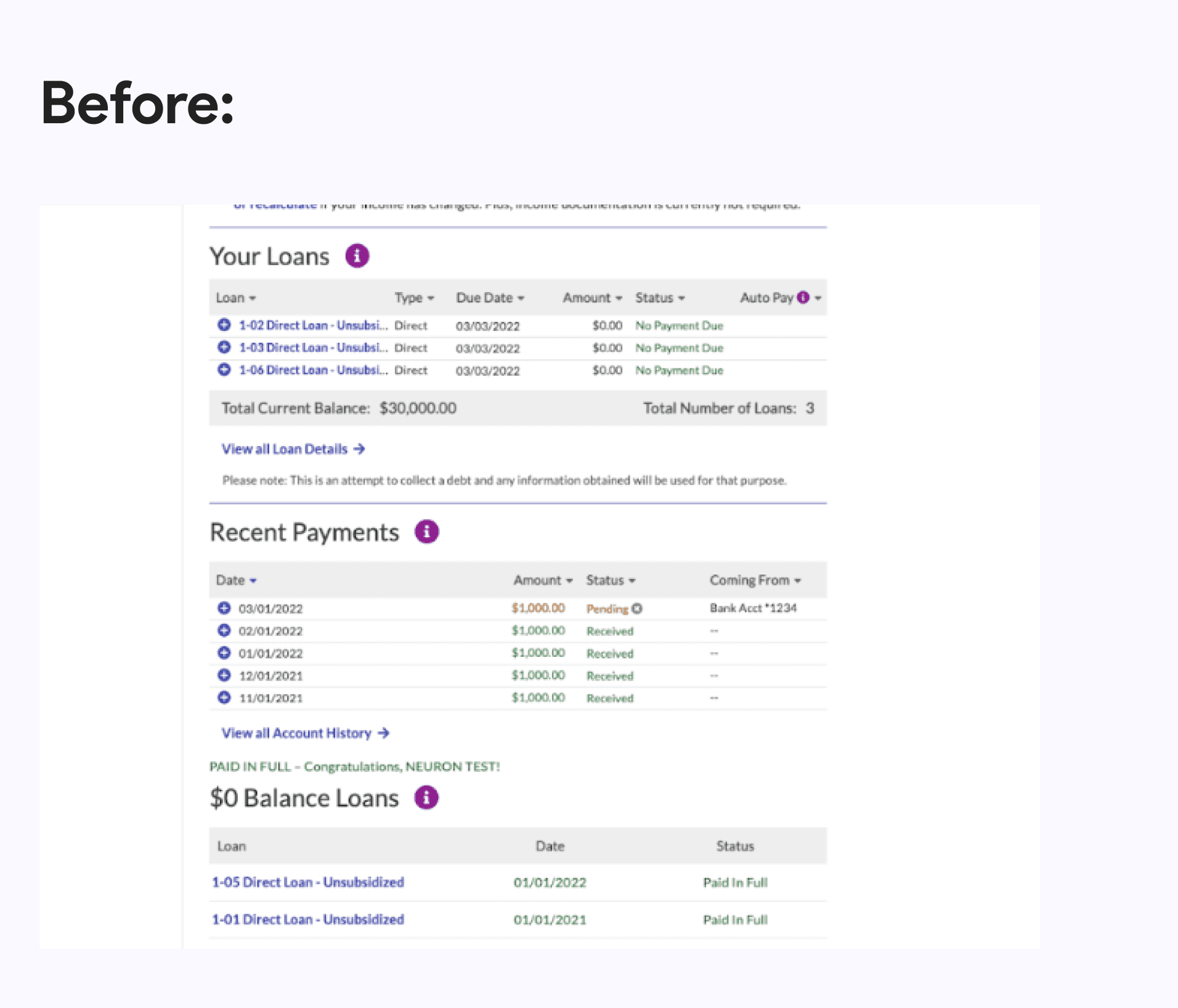
Too much information and clutter make key loan details hard to grasp, especially in "Your Loans"
02
Unintuitive
Navigation
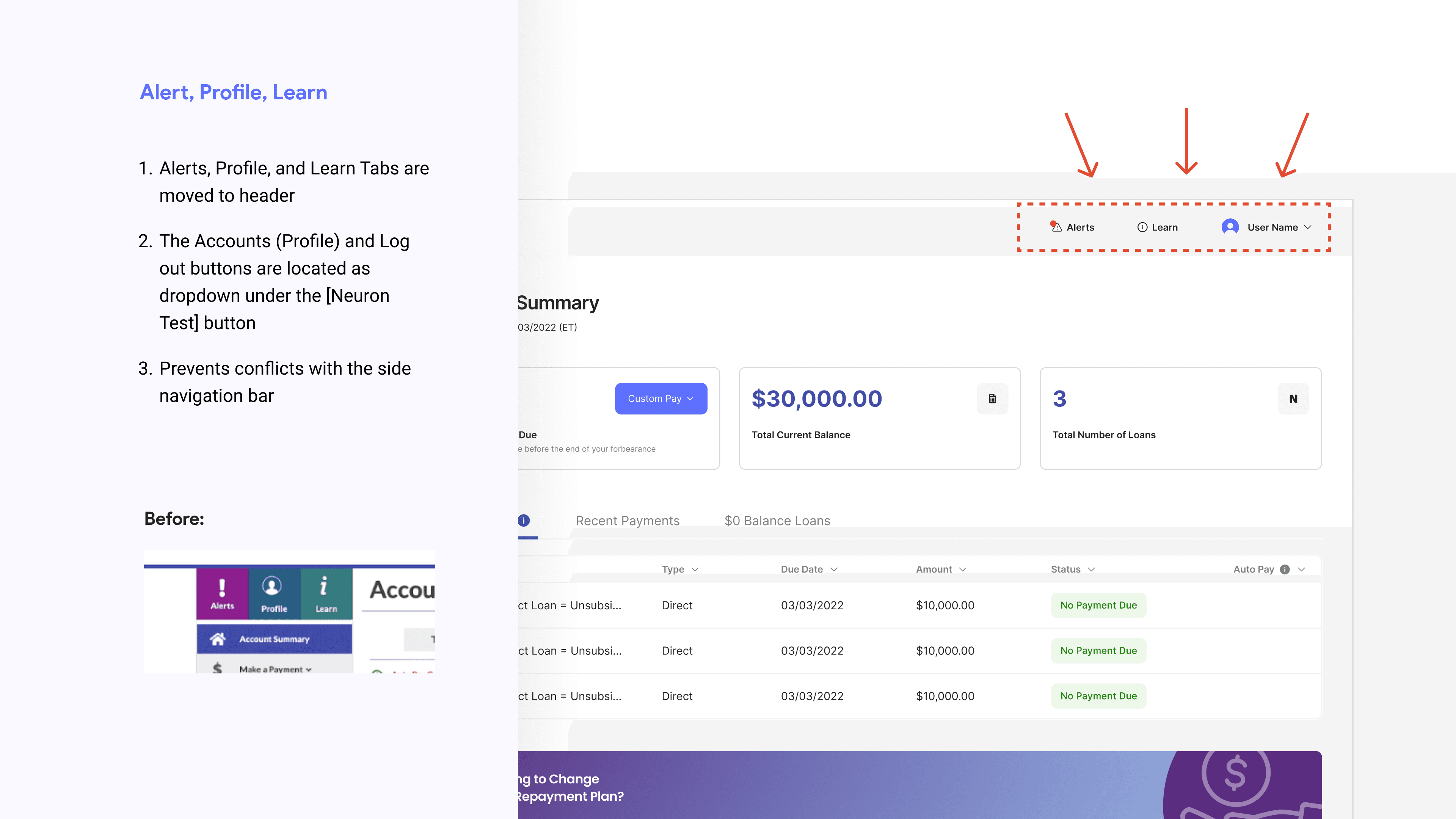
The sidebar menu is unclear and has redundant items like "Profile", making navigation harder
03
Ineffective
Alerts
Alert messages do not stand out due to competing colors and visual clutter, making it difficult for users to prioritize important updates
PROBLEM STATEMENT
Users are overwhelmed with excessive information, poor visual hierarchy, and an unintuitive navigation structure.
DESIGN APPROACH
Persona and User Journey
I began by developing a persona and user journey to not only represent the target users but also to build empathy with the actual user group on their goals, pain points, behaviors, and motivations. Mapping the user journey has helped me further identify key pain points and determine which features should be prioritized. This approach reflects my intent to design for the right user, at the right moment, with the right solution.

PROBLEM STATEMENT
How might we better visualize the current user's loan data and provide a more intuitive experience?
DESIGN IDEATION
Low-fi wireframes
I created low-fidelity wireframes to explore a range of interface design ideas and approaches.
My key goals were to:
Improve visual accessibility for primary information
Provide clear contrast between loan tables to enhance readability
Present content in a concise and easily digestible format
These objectives guided my design decisions and ensured a more user-friendly experience.

SOLUTION
Final Designs
I began by developing a persona and user journey to not only represent the target users but also to build empathy with the actual user group on their goals, pain points, behaviors, and motivations. Mapping the user journey has helped me further identify key pain points and determine which features should be prioritized. This approach reflects my intent to design for the right user, at the right moment, with the right solution.
01
Simplify content and enhance visual hierarchy for more intuitive loan details
02
Streamline alert system for heightened user awareness

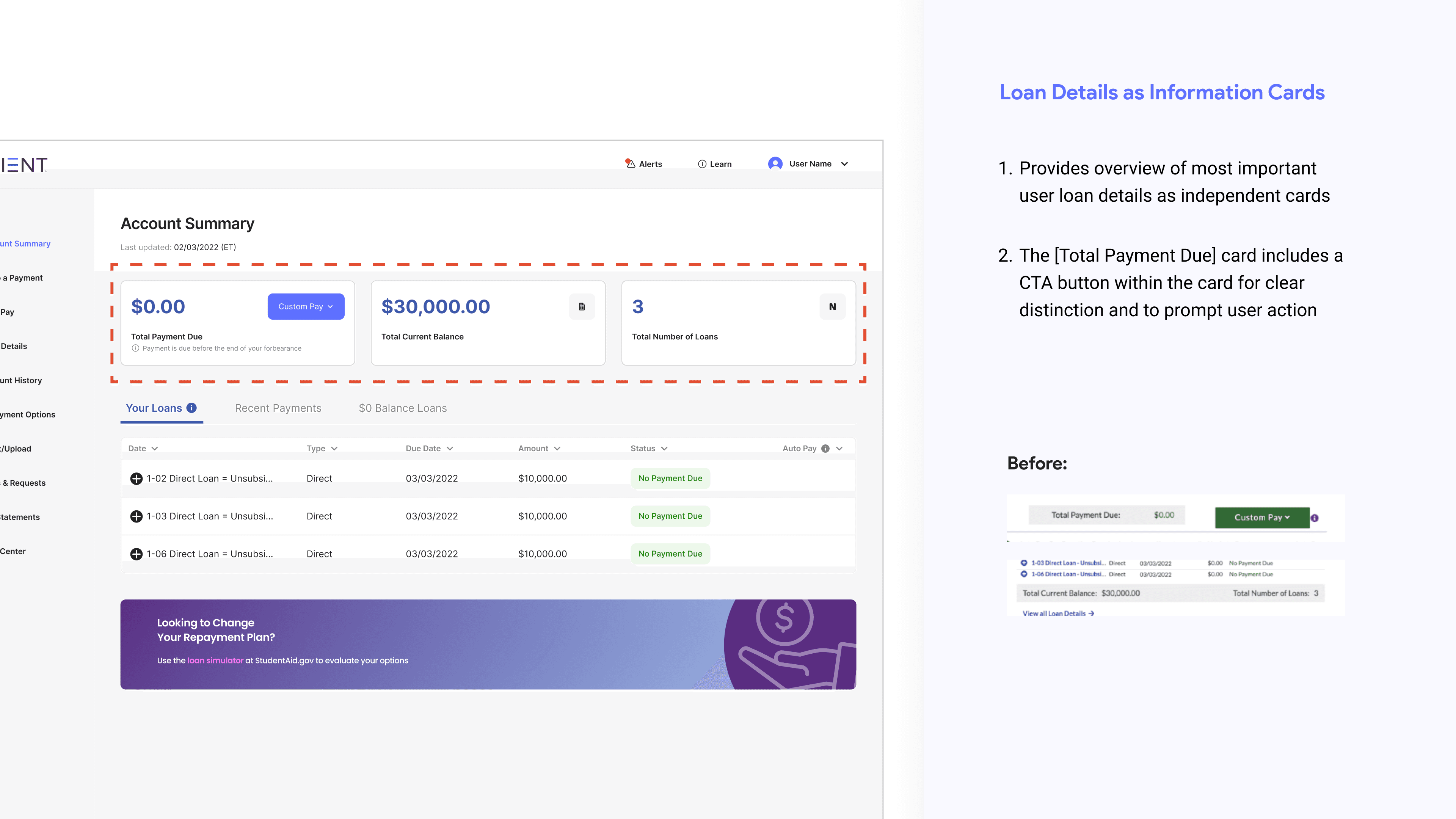

Loan Tables
Each loan tables are represented as tabs
Improved data readability as tables are not competing against each other
Ample space for all data to be displayed without the need of additional user step
VISUAL IDENTITY
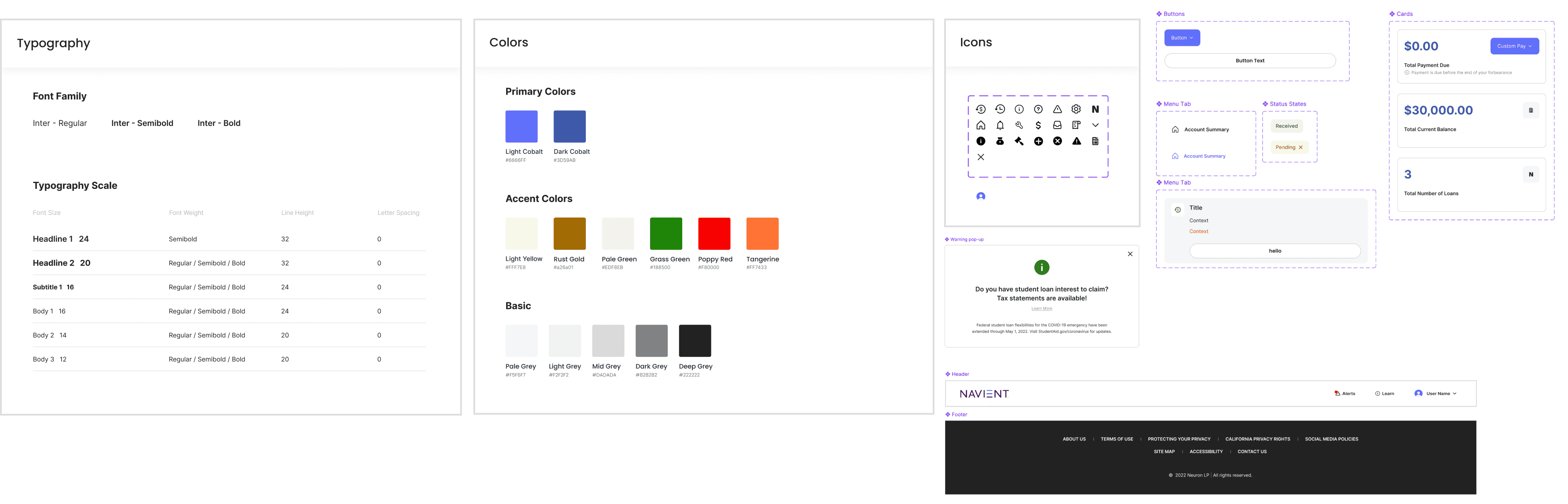
Style Guide
To achieve a more intuitive user interface that feels both modern and organized, I designed a new style guide to guide the redesign. This style guide helps maintain consistency in visual elements and supports usability by reinforcing clarity, readability, and accessibility across the platform.
FINAL THOUGHTS
What I learned
This challenge has taught me to navigate ambiguity while making thoughtful design choices.
Importance of designer to identify relevant information to make informed decisions in shaping user experience.
If I had more time..
Validate assumptions
In-depth user research with student loan website users
Explore more ways to increase information visibility for Alert notifications and Auto Pay options
Conduct usability testing on final design wireframes

Student Loan Website (Navient Redesign Challenge)
This project began as a design challenge to demonstrate my approach as a UX designer across various industries and subject matters. The first challenge was to redesign single existing Student Loan Account Summary page. Key design considerations include information hierarchy, visual hierarchy, and a modern UI to create a more effective, user-friendly interface for student loan website users.
The full Figma project file and case study deck could be found here.
ROLE
UI/UX Designer
TEAM
Solo
TOOL
Figma
DURATION
2-3 days
THE TASK
Redesign the UI/UX of the account summary page
To begin with, I didn't have strong understanding of what a student loan page is, as I have never personally used it or have seen my friends use it before. Given the unfamiliarity of the subject, I first did a short preliminary research on student loan websites and their account summary pages. I guided this research using three key questions that helped me understand their purpose and underlying intentions.
What is a student loan website?
What overview does account summary page give?
What information is most crucial?
SOLUTION
More intuitive loan details through visual hierarchy and better UI
Simplify content and enhance visual and information hierarchy for more intuitive loan details
Streamline alert system for heightened user awareness
INITIAL APPROACH
Let's start by defining
I first identified details that I already have knowledge of, or could find within the screenshot of the account summary page. Furthermore, designers are often required to make practical, research-backed assumptions when complete information isn’t available. With only a screenshot of one page provided in the design challenge, I made a few informed assumptions to guide my design decisions.
💡 What do I know already?
Screenshot of the account summary page was taken during Covid-19 pandemic, where student loan payments and interest were pause for federal loans
User has been granted forbearance
User no longer has IDR plan active
The total current balance is the unpaid balance of the loan
❓ Assumptions
$0.00 Total Payment Due is due to forbearance
Alerts on Account Summary page match those in the Alerts tab above navigation bar
Profile on tab matches those in header (redundant information)
Not all icons and colored texts are CTA buttons (blue are the only buttons)
USER AUDIT
Self user audit
I first performed a self user audit on the page to discover major, minor, and cosmetic problems that could be enhanced during this design challenge.
USER RESEARCH
Peer user testing
I asked peers to identify confusion or frustrations to uncover pain points, set clear goals, and research user needs.
Each of these peers has recently finished college or is currently in school.
OVERALL INSIGHTS
Key Insights
01
Information Overload &
Poor Visual Hierarchy
Too much information and clutter make key loan details hard to grasp, especially in "Your Loans"
02
Unintuitive
Navigation
The sidebar menu is unclear and has redundant items like "Profile", making navigation harder
03
Ineffective
Alerts
Alert messages do not stand out due to competing colors and visual clutter, making it difficult for users to prioritize important updates
PROBLEM STATEMENT
Users are overwhelmed with excessive information, poor visual hierarchy, and an unintuitive navigation structure.
DESIGN APPROACH
Persona and User Journey
I began by developing a persona and user journey to not only represent the target users but also to build empathy with the actual user group on their goals, pain points, behaviors, and motivations. Mapping the user journey has helped me further identify key pain points and determine which features should be prioritized. This approach reflects my intent to design for the right user, at the right moment, with the right solution.
PROBLEM STATEMENT
How might we better visualize the current user's loan data and provide a more intuitive experience?
DESIGN IDEATION
Low-fi wireframes
I created low-fidelity wireframes to explore a range of interface design ideas and approaches.
My key goals were to:
Improve visual accessibility for primary information
Provide clear contrast between loan tables to enhance readability
Present content in a concise and easily digestible format
These objectives guided my design decisions and ensured a more user-friendly experience.
SOLUTION
Final Designs
I began by developing a persona and user journey to not only represent the target users but also to build empathy with the actual user group on their goals, pain points, behaviors, and motivations. Mapping the user journey has helped me further identify key pain points and determine which features should be prioritized. This approach reflects my intent to design for the right user, at the right moment, with the right solution.
01
Simplify content and enhance visual hierarchy for more intuitive loan details
02
Streamline alert system for heightened user awareness
VISUAL IDENTITY
Style Guide
To achieve a more intuitive user interface that feels both modern and organized, I designed a new style guide to guide the redesign. This style guide helps maintain consistency in visual elements and supports usability by reinforcing clarity, readability, and accessibility across the platform.
FINAL THOUGHTS
What I learned
This challenge has taught me to navigate ambiguity while making thoughtful design choices.
Importance of designer to identify relevant information to make informed decisions in shaping user experience.
If I had more time..
Validate assumptions
In-depth user research with student loan website users
Explore more ways to increase information visibility for Alert notifications and Auto Pay options
Conduct usability testing on final design wireframes
Loan Tables
Each loan tables are represented as tabs
Improved data readability as tables are not competing against each other
Ample space for all data to be displayed without the need of additional user step
Student Loan Website (Navient Redesign Challenge)
This project began as a design challenge to demonstrate my approach as a UX designer across various industries and subject matters. The first challenge was to redesign single existing Student Loan Account Summary page. Key design considerations include information hierarchy, visual hierarchy, and a modern UI to create a more effective, user-friendly interface for student loan website users.
The full Figma project file and case study deck could be found here.
ROLE
UI/UX Designer
TEAM
Solo
TOOL
Figma
DURATION
2-3 days
THE TASK
Redesign the UI/UX of the account summary page
To begin with, I didn't have strong understanding of what a student loan page is, as I have never personally used it or have seen my friends use it before. Given the unfamiliarity of the subject, I first did a short preliminary research on student loan websites and their account summary pages. I guided this research using three key questions that helped me understand their purpose and underlying intentions.
What is a student loan website?
What overview does account summary page give?
What information is most crucial?
SOLUTION
More intuitive loan details through visual hierarchy and better UI
Simplify content and enhance visual and information hierarchy for more intuitive loan details
Streamline alert system for heightened user awareness
INITIAL APPROACH
Let's start by defining
I first identified details that I already have knowledge of, or could find within the screenshot of the account summary page. Furthermore, designers are often required to make practical, research-backed assumptions when complete information isn’t available. With only a screenshot of one page provided in the design challenge, I made a few informed assumptions to guide my design decisions.
💡 What do I know already?
Screenshot of the account summary page was taken during Covid-19 pandemic, where student loan payments and interest were pause for federal loans
User has been granted forbearance
User no longer has IDR plan active
The total current balance is the unpaid balance of the loan
❓ Assumptions
$0.00 Total Payment Due is due to forbearance
Alerts on Account Summary page match those in the Alerts tab above navigation bar
Profile on tab matches those in header (redundant information)
Not all icons and colored texts are CTA buttons (blue are the only buttons)
USER AUDIT
Self user audit
I first performed a self user audit on the page to discover major, minor, and cosmetic problems that could be enhanced during this design challenge.
USER RESEARCH
Peer user testing
I asked peers to identify confusion or frustrations to uncover pain points, set clear goals, and research user needs.
Each of these peers has recently finished college or is currently in school.
OVERALL INSIGHTS
Key Insights
01
Information Overload &
Poor Visual Hierarchy
Too much information and clutter make key loan details hard to grasp, especially in "Your Loans"
02
Unintuitive
Navigation
The sidebar menu is unclear and has redundant items like "Profile", making navigation harder
03
Ineffective
Alerts
Alert messages do not stand out due to competing colors and visual clutter, making it difficult for users to prioritize important updates
PROBLEM STATEMENT
Users are overwhelmed with excessive information,
poor visual hierarchy, and an unintuitive navigation structure.
DESIGN APPROACH
Persona and User Journey
I began by developing a persona and user journey to not only represent the target users but also to build empathy with the actual user group on their goals, pain points, behaviors, and motivations. Mapping the user journey has helped me further identify key pain points and determine which features should be prioritized. This approach reflects my intent to design for the right user, at the right moment, with the right solution.
PROBLEM STATEMENT
How might we better visualize the current user's loan data and provide a more intuitive experience?
DESIGN IDEATION
Low-fi wireframes
I created low-fidelity wireframes to explore a range of interface design ideas and approaches.
My key goals were to:
Improve visual accessibility for primary information
Provide clear contrast between loan tables to enhance readability
Present content in a concise and easily digestible format
These objectives guided my design decisions and ensured a more user-friendly experience.
SOLUTION
Final Designs
I began by developing a persona and user journey to not only represent the target users but also to build empathy with the actual user group on their goals, pain points, behaviors, and motivations. Mapping the user journey has helped me further identify key pain points and determine which features should be prioritized. This approach reflects my intent to design for the right user, at the right moment, with the right solution.
01
Simplify content and enhance visual hierarchy for more intuitive loan details
02
Streamline alert system for heightened user awareness
VISUAL IDENTITY
Style Guide
To achieve a more intuitive user interface that feels both modern and organized, I designed a new style guide to guide the redesign. This style guide helps maintain consistency in visual elements and supports usability by reinforcing clarity, readability, and accessibility across the platform.
FINAL THOUGHTS
What I learned
This challenge has taught me to navigate ambiguity while making thoughtful design choices.
Importance of designer to identify relevant information to make informed decisions in shaping user experience.
If I had more time..
Validate assumptions
In-depth user research with student loan website users
Explore more ways to increase information visibility for Alert notifications and Auto Pay options
Conduct usability testing on final design wireframes
Loan Tables
Each loan tables are represented as tabs
Improved data readability as tables are not competing against each other
Ample space for all data to be displayed without the need of additional user step
Student Loan Website (Redesign)
This project began as a design challenge to demonstrate my approach as a UX designer across various industries and subject matters. The first challenge was to redesign single existing Student Loan Account Summary page. Key design considerations include information hierarchy, visual hierarchy, and a modern UI to create a more effective, user-friendly interface for student loan website users.
The full Figma project file and case study deck could be found here.
ROLE
UI/UX Designer
TOOL
Figma
TEAM
Solo
DURATION
2-3 days
THE TASK
Redesign the UI/UX of the account summary page
To begin with, I didn't have strong understanding of what a student loan page is, as I have never personally used it or have seen my friends use it before. Given the unfamiliarity of the subject, I first did a short preliminary research on student loan websites and their account summary pages. I guided this research using three key questions that helped me understand their purpose and underlying intentions.
What is a student loan website?
What overview does account summary page give?
What information is most crucial?
SOLUTION
More intuitive loan details through visual hierarchy and better UI
Simplify content and enhance visual and information hierarchy for more intuitive loan details
Streamline alert system for heightened user awareness
INITIAL APPROACH
Let's start by defining
I first identified details that I already have knowledge of, or could find within the screenshot of the account summary page. Furthermore, designers are often required to make practical, research-backed assumptions when complete information isn’t available. With only a screenshot of one page provided in the design challenge, I made a few informed assumptions to guide my design decisions.
💡 What do I know already?
Screenshot of the account summary page was taken during Covid-19 pandemic, where student loan payments and interest were pause for federal loans
User has been granted forbearance
User no longer has IDR plan active
The total current balance is the unpaid balance of the loan
❓ Assumptions
$0.00 Total Payment Due is due to forbearance
Alerts on Account Summary page match those in the Alerts tab above navigation bar
Profile on tab matches those in header (redundant information)
Not all icons and colored texts are CTA buttons (blue are the only buttons)
USER AUDIT
Self user audit
I first performed a self user audit on the page to discover major, minor, and cosmetic problems that could be enhanced during this design challenge.
USER RESEARCH
Peer user testing
I asked peers to identify confusion or frustrations to uncover pain points, set clear goals, and research user needs.
Each of these peers has recently finished college or is currently in school.
OVERALL INSIGHTS
Key Insights
01
Information Overload &
Poor Visual Hierarchy
Too much information and clutter make key loan details hard to grasp, especially in "Your Loans"
02
Unintuitive Navigation
The sidebar menu is unclear and has redundant items like "Profile", making navigation harder
03
Ineffective Alerts
Alert messages do not stand out due to competing colors and visual clutter, making it difficult for users to prioritize important updates
PROBLEM STATEMENT
Users are overwhelmed with excessive information, poor visual hierarchy, and an unintuitive navigation structure.
DESIGN APPROACH
Persona and User Journey
I began by developing a persona and user journey to not only represent the target users but also to build empathy with the actual user group on their goals, pain points, behaviors, and motivations. Mapping the user journey has helped me further identify key pain points and determine which features should be prioritized. This approach reflects my intent to design for the right user, at the right moment, with the right solution.
PROBLEM STATEMENT
How might we better visualize the current user's loan data and provide a more intuitive experience?
DESIGN IDEATION
Low-fi wireframes
I created low-fidelity wireframes to explore a range of interface design ideas and approaches.
My key goals were to:
Improve visual accessibility for primary information
Provide clear contrast between loan tables to enhance readability
Present content in a concise and easily digestible format
These objectives guided my design decisions and ensured a more user-friendly experience.
SOLUTION
Final Designs
I began by developing a persona and user journey to not only represent the target users but also to build empathy with the actual user group on their goals, pain points, behaviors, and motivations. Mapping the user journey has helped me further identify key pain points and determine which features should be prioritized. This approach reflects my intent to design for the right user, at the right moment, with the right solution.
01
Simplify content and enhance visual hierarchy for more intuitive loan details
02
Streamline alert system for heightened user awareness
VISUAL IDENTITY
Style Guide
To achieve a more intuitive user interface that feels both modern and organized, I designed a new style guide to guide the redesign. This style guide helps maintain consistency in visual elements and supports usability by reinforcing clarity, readability, and accessibility across the platform.
FINAL THOUGHTS
What I learned
This challenge has taught me to navigate ambiguity while making thoughtful design choices.
Importance of designer to identify relevant information to make informed decisions in shaping user experience.
If I had more time..
Validate assumptions
In-depth user research with student loan website users
Explore more ways to increase information visibility for Alert notifications and Auto Pay options
Conduct usability testing on final design wireframes
Loan Tables
Each loan tables are represented as tabs
Improved data readability as tables are not competing against each other
Ample space for all data to be displayed without the need of additional user step