
APTNER pass v2.0
APTNER, an IT company based in South Korea, focuses on enhancing residential convenience within apartment complexes.
APTNER pass is an embedded app within APTNER that allows residents to reserve communal spaces and amenities within their apartment complexes.
ROLE
Product Designer (UI/UX)
Design System
TEAM
Jungho Yoo
Doohyeon Kim
Jungkoo Lee
Hyekyung Park
TOOL
Figma
Illustrator
DURATION
Feb-Mar 2023
OVERVIEW
APTNER pass is a service embedded within APTNER's app, designed to help residents reserve communal activities and amenities in advance within apartment complexes. As the sole UI/UX Designer in a team of five (Project Manager, Frontend Engineer, Backend Engineer, and CS Manager), I was responsible for revamping the user experience for APTNER pass users to v2.0. This involved creating a seamless user flow and integrating a user interface that aligned with APTNER's existing design system. I took full ownership of the project across all stages, from research and design to execution, making numerous design decisions that optimized key user touchpoints.
THE PROBLEM
Instead of using the app, residents were using in-person kiosks
Due to inconsistent designs and convoluted user flows, residents were found using the in-person kiosks over remote reservations through APTNER pass. This not only increased operational costs but also led to higher customer complaints and frustration, as reflected in support invoices.

APTNER pass is designed in an aspect that is not uniform with the rest of the app(APTNER)’s design system and has a convoluted user flow that disrupts the user experience. While the APTNER mobile app has undergone multiple redesigns over the past five years, APTNER pass had remained untouched. The original user interface, developed by engineers without user research, lacked empathy and convenience.
SOLUTION
(1) Streamline user flow with templates (2) Build and apply its own design system
APTNER pass is designed in an aspect that is not uniform with the rest of the app(APTNER)’s design system and has a convoluted user flow that disrupts the user experience. While the APTNER mobile app has undergone multiple redesigns over the past five years, APTNER pass had remained untouched. The original user interface, developed by engineers without user research, lacked empathy and convenience.

INITIAL IDEA
Understand the problem
I first approached the problem by mapping the information architecture to understand the existing user flow, where I identified that there could be up to 29 different amenities within an apartment complex. I also found that these amenities share common tasks, which could be integrated into a unified experience.


I identified the potential to template all 29 amenities into four reservation types, with all amenities aligning to one of these predefined reservations processes. By templating all amenities into these four structured reservation types (room, seat, program, cafeteria), I established a consistent information architecture and reduced the number of user flows from 29 to four.
USER RESEARCH
Identifying MVP through defining core needs and frustrations
APTNER pass has always undergone constant VOC, frustrations from our customers. In order to understand the underlying problems and areas of opportunity, our team first suggested that we identify user needs through accumulated CS invoices from the past year. However, I suggested that in order to truly understand why these core needs and frustrations surface and to really identify the root causes behind them, we must perform user research and communicate with our end users.
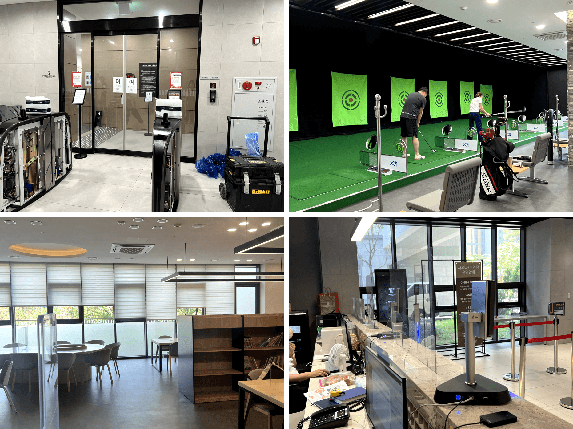
Ansan GranX City II – A Partnering Apartment Complex of APTNER
I visited one of APTNER's partnering apartment complex, and performed guerrilla testing on the residents that have used APTNER pass.

KEY INSIGHTS
User Research Findings

VISUAL IDENTITY
Implementing consistency through developing independent design system
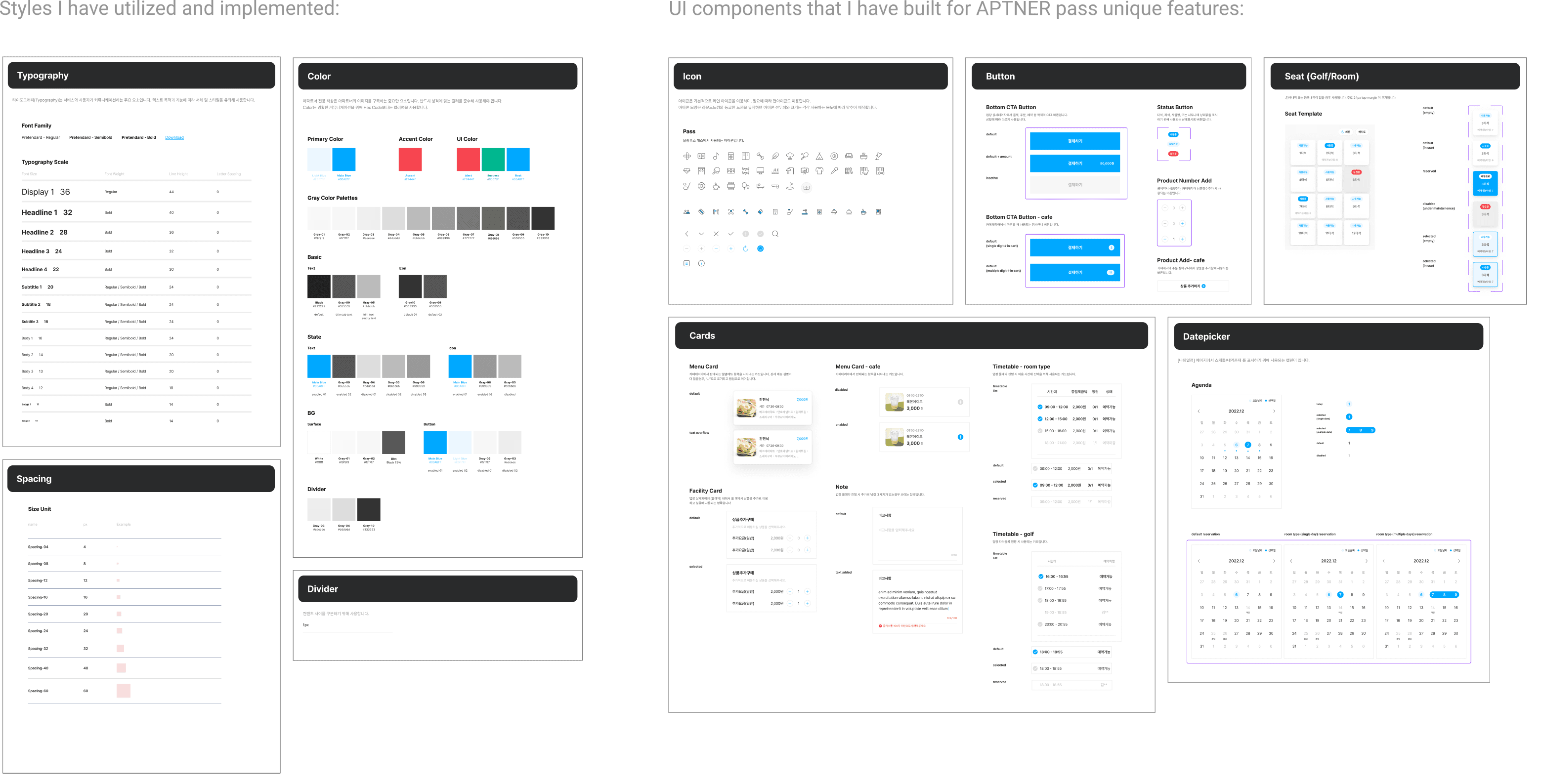
To create a cohesive user experience and reduce confusion, I developed independent design system based on its mother app, APTNER's existing design system. To keep the visual identity, I utilized existing typography, spacing, colors, and layouts, while developing any additional necessary UI components specific to APTNER pass's unique features.
↓ ↓ ↓
Check out this case study for a detailed look at the design process using the design system

APTNER pass - Design System
Style Implementation
Visit Page
DESIGN DECISIONS
Optimize user flow based on four reservation types
To provide a simpler, more intuitive reservation process, I created four templates that can be easily applied across different amenities within apartment complexes.

Room Type
Guest Room, Screen Golf, Ping-Pong, Camping, Multi-purpose
Enhanced clarity through use of primary and secondary colors.
Added key (indicator) to help users distinguish between "Today" and date of selection.
Applied progressive disclosure to enhance user understanding and reduce errors.
Seat Type
Golf, Library, Study Room
Added labels to individual seats to help users identify availability easily.
Applied consistent spacing based on the design guidelines.
Applied progressive disclosure to enhance user understanding and reduce errors.

Program Type
Gym, Pool, Sauna, Fitness, G.X, Kid's Cafe
Removed instructor profile button and unified all profile buttons to reduce confusion.
Added price onto CTA button to enhance visibility and avoid long scrolls.
Cafe Type
Cafeteria (Ordering)
By separating "Order" and "Checkout" into two screens, I applied progressive disclosure to minimize user errors.
Added toast notifications for a smoother and more intuitive experience.
FINAL THOUGHTS
Outcome
Through multiple rounds of feedback and design revisions with the team, I received approval for the final design but resigned during development to align with my graduate school schedule. Later, I learned that while development was completed, the project was put on hold due to additional changes requested during executive decision-making, due to the nature of startup.
What did I learn?
The importance of open communication within the team and effective communication methods when working with engineers
Utilizing heuristic evaluation to ensure internal consistency and error prevention
HOW MIGHT WE?
Problem Statement
While the Guggenheim Museum's official website offers in-depth guides and assistance, the on-site experience falls short, leading to frustration and limited engagement for visitors.
What are the existing pain points during in-person visits to the Guggenheim?
How can visitors interact and augment their experience at the museum?
APTNER pass v2.0
APTNER, an IT company based in South Korea, focuses on enhancing residential convenience within apartment complexes.
APTNER pass is an embedded app within APTNER that allows residents to reserve communal spaces and amenities within their apartment complexes.
ROLE
Product Designer (UI/UX)
Design System
TEAM
Jungho Yoo
Doohyeon Kim
Jungkoo Lee
Hyekyung Park
TOOL
Figma
Illustrator
DURATION
Feb-Mar 2023
OVERVIEW
APTNER pass is a service embedded within APTNER's app, designed to help residents reserve communal activities and amenities in advance within apartment complexes. As the sole UI/UX Designer in a team of five (Project Manager, Frontend Engineer, Backend Engineer, and CS Manager), I was responsible for revamping the user experience for APTNER pass users to v2.0. This involved creating a seamless user flow and integrating a user interface that aligned with APTNER's existing design system. I took full ownership of the project across all stages, from research and design to execution, making numerous design decisions that optimized key user touchpoints.
THE PROBLEM
Instead of using the app, residents were using in-person kiosks
Due to inconsistent designs and convoluted user flows, residents were found using the in-person kiosks over remote reservations through APTNER pass. This not only increased operational costs but also led to higher customer complaints and frustration, as reflected in support invoices.
APTNER pass is designed in an aspect that is not uniform with the rest of the app(APTNER)’s design system and has a convoluted user flow that disrupts the user experience. While the APTNER mobile app has undergone multiple redesigns over the past five years, APTNER pass had remained untouched. The original user interface, developed by engineers without user research, lacked empathy and convenience.
SOLUTION
(1) Streamline user flow with templates (2) Build and apply its own design system
APTNER pass is designed in an aspect that is not uniform with the rest of the app(APTNER)’s design system and has a convoluted user flow that disrupts the user experience. While the APTNER mobile app has undergone multiple redesigns over the past five years, APTNER pass had remained untouched. The original user interface, developed by engineers without user research, lacked empathy and convenience.
INITIAL IDEA
Understand the problem
I first approached the problem by mapping the information architecture to understand the existing user flow, where I identified that there could be up to 29 different amenities within an apartment complex. I also found that these amenities share common tasks, which could be integrated into a unified experience.
I identified the potential to template all 29 amenities into four reservation types, with all amenities aligning to one of these predefined reservations processes. By templating all amenities into these four structured reservation types (room, seat, program, cafeteria), I established a consistent information architecture and reduced the number of user flows from 29 to four.
USER RESEARCH
Identifying MVP through defining core needs and frustrations
APTNER pass has always undergone constant VOC, frustrations from our customers. In order to understand the underlying problems and areas of opportunity, our team first suggested that we identify user needs through accumulated CS invoices from the past year. However, I suggested that in order to truly understand why these core needs and frustrations surface and to really identify the root causes behind them, we must perform user research and communicate with our end users.
Ansan GranX City II – A Partnering Apartment Complex of APTNER
I visited one of APTNER's partnering apartment complex, and performed guerrilla testing on the residents that have used APTNER pass.
KEY INSIGHTS
User Research Findings
VISUAL IDENTITY
Implementing consistency through developing independent design system
To create a cohesive user experience and reduce confusion, I developed independent design system based on its mother app, APTNER's existing design system. To keep the visual identity, I utilized existing typography, spacing, colors, and layouts, while developing any additional necessary UI components specific to APTNER pass's unique features.
↓ ↓ ↓
Check out this case study for a detailed look at the design process using the design system
APTNER pass - Design System
Style Implementation
Visit Page
DESIGN DECISIONS
Optimize user flow based on four reservation types
To provide a simpler, more intuitive reservation process, I created four templates that can be easily applied across different amenities within apartment complexes.
Room Type
Guest Room, Screen Golf, Ping-Pong, Camping, Multi-purpose
Enhanced clarity through use of primary and secondary colors.
Added key (indicator) to help users distinguish between "Today" and date of selection.
Applied progressive disclosure to enhance user understanding and reduce errors.
Seat Type
Golf, Library, Study Room
Added labels to individual seats to help users identify availability easily.
Applied consistent spacing based on the design guidelines.
Applied progressive disclosure to enhance user understanding and reduce errors.
Program Type
Gym, Pool, Sauna, Fitness, G.X, Kid's Cafe
Removed instructor profile button and unified all profile buttons to reduce confusion.
Added price onto CTA button to enhance visibility and avoid long scrolls.
Cafe Type
Cafeteria (Ordering)
By separating "Order" and "Checkout" into two screens, I applied progressive disclosure to minimize user errors.
Added toast notifications for a smoother and more intuitive experience.
FINAL THOUGHTS
Outcome
Through multiple rounds of feedback and design revisions with the team, I received approval for the final design but resigned during development to align with my graduate school schedule. Later, I learned that while development was completed, the project was put on hold due to additional changes requested during executive decision-making, due to the nature of startup.
What did I learn?
The importance of open communication within the team and effective communication methods when working with engineers
Utilizing heuristic evaluation to ensure internal consistency and error prevention
APTNER pass v2.0
APTNER, an IT company based in South Korea, focuses on enhancing residential convenience within apartment complexes. APTNER pass is an imbedded app within APTNER that allows residents to reserve communal spaces and amenities within their apartment complexes.
DURATION
Feb-Mar 2023
TEAM
Jungho Yoo
Doohyeon Kim
Jungkoo Lee
Hyekyung Park
ROLE
Product Designer (UI/UX)
Design System
TOOL
Figma
Illustrator
OVERVIEW
APTNER pass is a service embedded within APTNER's app, designed to help residents reserve communal activities and amenities in advance within apartment complexes. As the sole UI/UX Designer in a team of five (Project Manager, Frontend Engineer, Backend Engineer, and CS Manager), I was responsible for revamping the user experience for APTNER pass users to v2.0. This involved creating a seamless user flow and integrating a user interface that aligned with APTNER's existing design system. I took full ownership of the project across all stages, from research and design to execution, making numerous design decisions that optimized key user touchpoints.
THE PROBLEM
Instead of using the app, residents were using in-person kiosks
Due to inconsistent designs and convoluted user flows, residents were found using the in-person kiosks over remote reservations through APTNER pass. This not only increased operational costs but also led to higher customer complaints and frustration, as reflected in support invoices.
APTNER pass is designed in an aspect that is not uniform with the rest of the app(APTNER)’s design system and has a convoluted user flow that disrupts the user experience. While the APTNER mobile app has undergone multiple redesigns over the past five years, APTNER pass had remained untouched. The original user interface, developed by engineers without user research, lacked empathy and convenience.
SOLUTION
(1) Streamline user flow with templates (2) Build and apply its own design system
APTNER pass is designed in an aspect that is not uniform with the rest of the app(APTNER)’s design system and has a convoluted user flow that disrupts the user experience. While the APTNER mobile app has undergone multiple redesigns over the past five years, APTNER pass had remained untouched. The original user interface, developed by engineers without user research, lacked empathy and convenience.
INITIAL IDEA
Understand the problem
I first approached the problem by mapping the information architecture to understand the existing user flow, where I identified that there could be up to 29 different amenities within an apartment complex. I also found that these amenities share common tasks, which could be integrated into a unified experience.
I identified the potential to template all 29 amenities into four reservation types, with all amenities aligning to one of these predefined reservations processes. By templating all amenities into these four structured reservation types (room, seat, program, cafeteria), I established a consistent information architecture and reduced the number of user flows from 29 to four.
USER RESEARCH
Identifying MVP through defining core needs and frustrations
APTNER pass has always undergone constant VOC, frustrations from our customers. In order to understand the underlying problems and areas of opportunity, our team first suggested that we identify user needs through accumulated CS invoices from the past year. However, I suggested that in order to truly understand why these core needs and frustrations surface and to really identify the root causes behind them, we must perform user research and communicate with our end users.
Ansan GranX City II – A Partnering Apartment Complex of APTNER
I visited one of APTNER's partnering apartment complex, and performed guerrilla testing on the residents that have used APTNER pass.
KEY INSIGHTS
User Research Findings
VISUAL IDENTITY
Implementing consistency through developing independent design system
To create a cohesive user experience and reduce confusion, I developed independent design system based on its mother app, APTNER's existing design system. To keep the visual identity, I utilized existing typography, spacing, colors, and layouts, while developing any additional necessary UI components specific to APTNER pass's unique features.
↓ ↓ ↓
Check out this case study for a detailed look at the design process using the design system
APTNER pass - Design System
Style Implementation
Visit Page
DESIGN DECISIONS
Optimize user flow based on four reservation types
To provide a simpler, more intuitive reservation process, I created four templates that can be easily applied across different amenities within apartment complexes.
Room Type
Guest Room, Screen Golf, Ping-Pong, Camping,
Multi-purpose
Enhanced clarity through use of primary and secondary colors.
Added key (indicator) to help users distinguish between "Today" and date of selection.
Applied progressive disclosure to enhance user understanding and reduce errors.
Seat Type
Golf, Library, Study Room
Added labels to individual seats to help users identify availability easily.
Applied consistent spacing based on the design guidelines.
Applied progressive disclosure to enhance user understanding and reduce errors.
Program Type
Gym, Pool, Sauna, Fitness, G.X, Kid's Cafe
Removed instructor profile button and unified all profile buttons to reduce confusion.
Added price onto CTA button to enhance visibility and avoid long scrolls.
Cafe Type
Gym, Pool, Sauna, Fitness, G.X, Kid's Cafe
By separating "Order" and "Checkout" into two screens, I applied progressive disclosure to minimize user errors.
Added toast notifications for a smoother and more intuitive experience.
FINAL THOUGHTS
Outcome
Through multiple rounds of feedback and design revisions with the team, I received approval for the final design but resigned during development to align with my graduate school schedule. Later, I learned that while development was completed, the project was put on hold due to additional changes requested during executive decision-making, due to the nature of startup.
What did I learn?
The importance of open communication within the team and effective communication methods when working with engineers
Utilizing heuristic evaluation to ensure internal consistency and error prevention